Corporate Logo
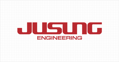
Jusung Engineering’s logo, as a core element to display its corporate image, was developed to express the company’s strong commitment to developing into a hi-tech company leading the world in the semiconductor and display device sectors using only a wordmark without a separate symbol mark. The wordmark, which mainly uses bold, straight lines and eliminates other complex elements, symbolizes our strong will to be the world’s best. The capital letter S is connected to the Us on both sides to express our vision as a global business communicating with the universe. The main red color reflects the image of a hi-tech company with strong enthusiasm.
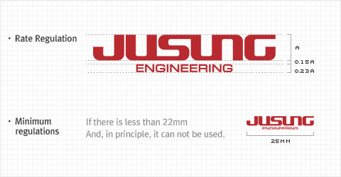
Logo Usage
Only lay out 'JUSUNG' and 'ENGINEERING' vertically in English without a separate symbol mark. Korean and English may be written in parallel, but the wordmark 'JUSUNG' must be in English. In exceptional cases in which the logo is used in a smaller size than regulated, check that readability is sufficient using an advance test.
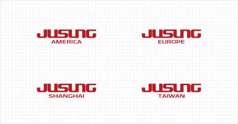
Affiliates Logo
When indicating overseas affiliates of JUSUNG ENGINEERING, 'JUSUNG' and the affiliate name should be combined horizontally as shown using an English combination of basic signatures, but make it a rule to use English at all times.
Jusung Colors
As the main color of JUSUNG ENGINEERING is a critical element to deliver a consistent image across various forms of media including print, promotion materials, and signs, the precise color, brightness, and saturation must be maintained. In principle, spot color printing should be used for accurate management, but process color may be accepted if spot color is not possible. In such a case, since printing conditions may differ depending on various parameters such as obsoleteness and quality of the printing machine, adjustments should be made according to the basic ratios defined below, but the closest ratios to pantone color must be achieved before printing. Furthermore, assistant colors may be used in special cases.


